

App icons are the most distorted cost-performance species in the design world: occupying no more than a fingernail's area, they represent your user's first encounter with your product. In app store listings, icon refinement directly influences the split-second decision to "download or swipe away." Research and industry consensus agree that store conversion rates correlate strongly with icon quality. However, executing this well is surprisingly difficult: it must remain crisp at 60×60 pixels, work on both light and dark backgrounds, offer recognizability while staying relevant to your theme—this is the quintessential "small but specialized" design challenge.
Independent developers find themselves in an awkward position here: after spending three months writing product code, they get stuck on a single square. Hiring a designer costs hundreds or thousands of dollars—a steep price for a side project; attempting Figma yourself often lacks sufficient design foundation. Appicons AI targets this narrow gap by using AI to generate app icons specifically.
What is Appicons AI?
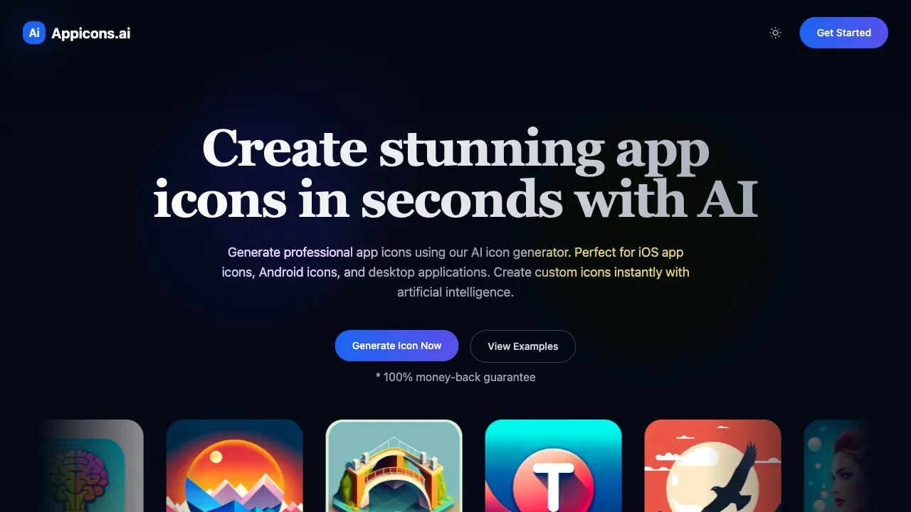
Appicons AI (appicons.ai) is an AI tool specialized in generating app icons: you describe your desired icon via text prompt—including theme, style, and color palette—and the AI produces a batch of professional-quality design options ready for download across various platform specifications upon selection.
"Specialized" marks its essential distinction from general-purpose AI image generators: generation is pre-constrained within "icon grammar"—composition naturally centers on the subject, features a single dominant element, detail density stays readable at small scales, and automatically adapts to rounded corner masks. You can draw icons with Midjourney too, but you must wrestle with prompts to make them "look like an icon"; Appicons AI pre-bakes these struggles into product defaults.
Key Features
Text-to-Icon Generation
The core workflow boils down to one sentence: describe → generate multiple options → select and download. Prompts support natural language, such as "minimalist alarm clock icon with deep blue gradient background and white lines" or "cute cartoon Shiba Inu headshot in warm orange tones with a rounded style."
Styles cover current mainstream aesthetics found in app stores:
- Flat Minimalism: Clean lines and color blocks characteristic of the iOS ecosystem
- 3D Texture: Volumetric lighting, soft Big Sur-style material finishes—a popular direction in recent icon design trends
- Gradient Modern: Fashionable combinations pairing gradient backgrounds with simple subjects
- Illustration Hand-drawn: A warmer, stylized approach
Multi-Platform Size Exporting
Export assets in one click according to platform specifications after generation: iOS's primary icon at 1024×1024, Android's multi-density asset sets, and macOS rounded-corner specs. Icon size adaptation is arguably the most tedious manual labor involved in an app store submission process; automating it is simply what a vertical tool like this should do for you.
Batch Comparison of Solutions
Generate multiple variants at once to compare side-by-side: if the direction feels right but details fall short, continue iterating based on feedback. The randomness inherent in AI generation actually becomes an asset here—keep generating until one finally hits the mark.
Comparison with Alternatives
vs Hiring a Designer: Professional designers bring strategic thinking (brand continuity, competitor differentiation) and precise execution that AI cannot replicate; however, this comes at a cost of hundreds to thousands of dollars and several days' turnaround time. For formal products with ample budgets, hire a designer; for validation-phase projects or independent development, use AI—the distinction is clear-cut.
vs Icon Asset Libraries (Flaticon/Icons8): Assets in these libraries have clear licensing terms and stable quality, but they are all "off-the-shelf"—the probability of finding one that perfectly fits your app's theme is low, while the chance of encountering a duplicate icon is surprisingly high. AI generates unique pieces customized according to your specific descriptions.
vs Midjourney/DALL-E: General-purpose tools offer higher upper limits for image quality, but you must solve all "iconification" constraints yourself (composition, negative space, size adaptation) and handle post-generation cropping; Appicons AI trades off some peak potential for convenience, resulting in a much shorter workflow for icon needs with clear objectives.
vs Drawing Yourself in Figma: A fully controllable professional path, provided you have the requisite skills and time. The essence of an AI solution is to provide developers who cannot design themselves with a respectable alternative.
vs Generating Directly via GPT-4o/Jimeng: Multimodal large models are making rapid progress at generating icons; they offer strong flexibility. The remaining advantage for vertical tools lies in engineering support such as multi-size exporting. Feel free to try both approaches.
Who Should Use Appicons AI
Independent Developers: This is the core audience. An app represents a solo creator's work, so icons can no longer be made up with screenshots—AI solutions generate batches of viable options within minutes, delivering quality sufficient for respectable store submission.
Hackathons and Course Projects: In scenarios where time is measured in hours, materials like icons—which are essential but leave no room for polishing—are best solved by AI; it's the standard answer.
Early-Stage Startup Teams: Burning design budget on icons during the MVP phase isn't worth it, yet visual polish in investor pitches genuinely impacts perception; AI-generated icons represent a reasonable middle ground.
Product Managers Creating Prototypes: App models within demos and proposals need respectable icons to carry their weight, offering an order of magnitude more persuasiveness than gray placeholder blocks.
Usage Tips
Descriptions should cover the four key elements: subject + style + color palette + atmosphere. A description like "a blue icon" is ineffective; specifying something such as "modern flat-style headphone icon with a gradient background transitioning from deep blue to purple, white minimalist lines, and a tech vibe" will yield targeted results.
Always perform a "small-size test" after generation: shrink your candidate icons down to 60 pixels to ensure they remain recognizable—where large images look great but small ones blur into an indistinguishable mess is the classic trap of icon design, and AI-generated outputs are no exception.
Don't discard options that have the right direction but lack detail: export them and make localized refinements in Figma or Photoshop; this approach is faster than re-drawing cards from scratch or designing anew.
Before commercial use, verify the licensing terms for generated content and ensure your style doesn't resemble existing well-known app icons—app store reviewers do have precedents regarding icon similarity disputes.
Pricing
No tiers or amounts are published on public pages, so no figures are given here.
Two things are verifiable: the homepage advertises a 100% money-back guarantee, which indicates a paid purchase step; and the flow is describe your icon, let GPT enhance the prompt, generate, optionally edit in Photopea, then export a 1024×1024 PNG.
Check appicons.ai itself for current prices and allowances.