

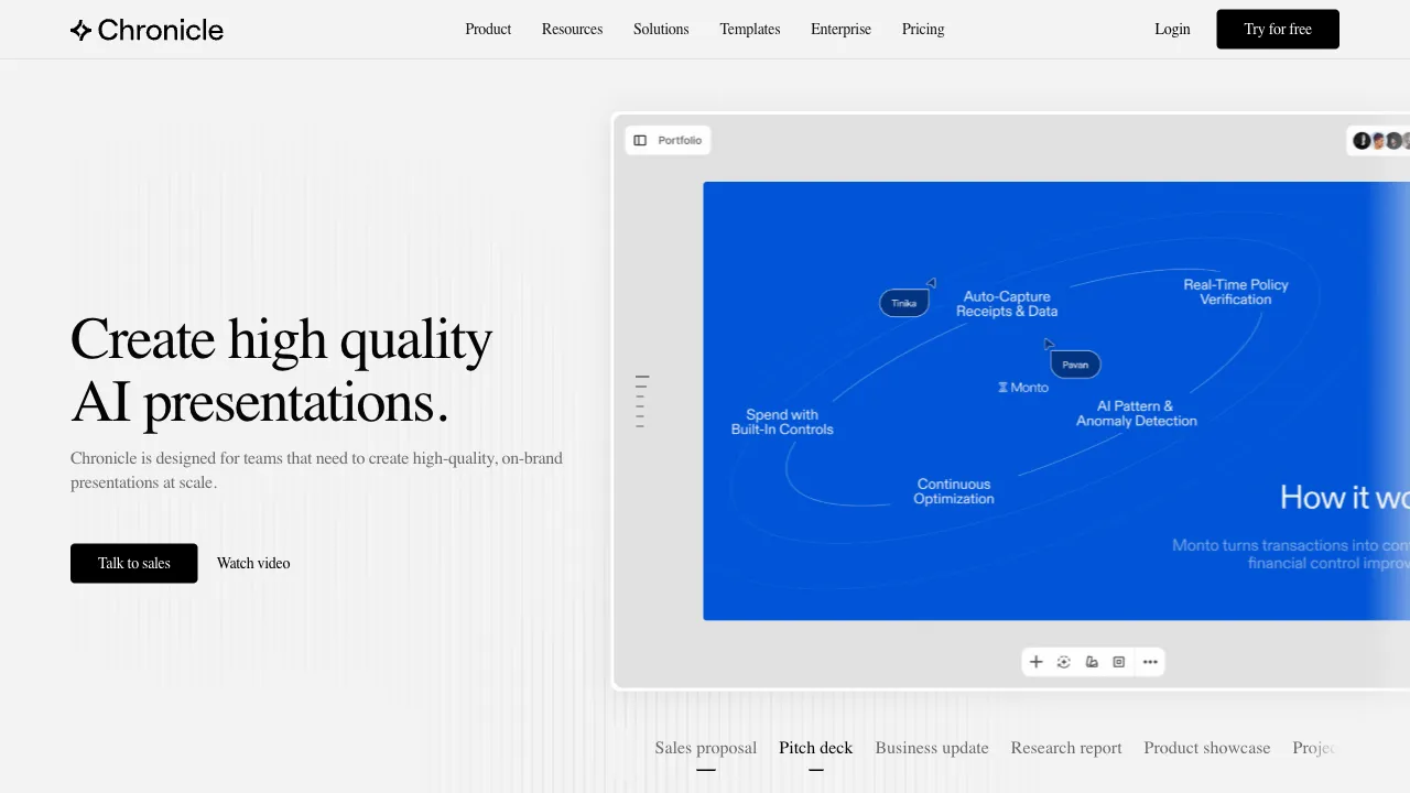
PowerPoint suffers from a stubborn "inertia of ugliness": PowerPoint has ruled the presentation world for thirty years, yet it hands users a blank canvas and infinite freedom—freedom that is precisely the source of disaster. Without design training, the output on a free canvas is likely to be bolded Songti fonts, rainbow color schemes, and elements perpetually two pixels off-center—the "classic corporate PPT" aesthetic. The problem has never been insufficient tool features; it’s that the tools have dumped all design responsibility onto the user.
Chronicle’s product philosophy is a rebellion against this freedom: rather than offering you ten thousand ways to make your slides ugly, it locks the design system to a high aesthetic baseline—you just focus on content, and it simply can’t look bad. Built by a team with backgrounds at Uber and Meta, this tool has already made waves in the design community since its debut with an aura of "haute couture for presentations."
What is Chronicle?
Chronicle (chroniclehq.com) is a next-generation online presentation tool whose core selling point is default beauty: carefully crafted layout systems, restrained typography and color palettes, and visual quality on par with modern SaaS websites. Combined with AI-assisted generation and block-based editing, it lowers the barrier to "creating professional-looking presentations" to "just knowing how to type."
The key to understanding it lies in a shift in mindset: traditional PPT is about "drawing pages," while Chronicle is about "filling in content"—layout aesthetics are handled by the system, and user freedom is deliberately constrained within safe boundaries. This design philosophy of "constraints as liberation" is the shared lineage of productivity tools like Notion and Linear.
Core Features
Visual Quality Backed by a Design System
This is its greatest product asset. Its templates are not merely "templates"; they constitute an entire responsive design system: you fill in content, and layout, spacing, type scale, and color automatically maintain professional standards; change a layout, and the content automatically re-adapts. The result is that even if you know nothing about design, the visual floor of your output remains firmly at the level of "looks like it was made by a professional team."
Compared to the traditional workflow of "spending two hours adjusting alignment and color after finishing the content," this safety net saves not just time, but also the psychological burden on non-designers.
Block-Based Editing
Content is organized in blocks (text, images, charts, video, embeds), allowing drag-and-drop reorganization with what-you-see-is-what-you-get editing—Notion users will feel right at home immediately. The block structure naturally prevents the classic chaos of PPT where "elements fly around and layers become a tangled mess," making the editing experience closer to writing a document than designing a poster.
AI-Assisted Generation
Input a topic or outline, and the AI plans the page structure and key content points, drafting within the framework of the design system. Its AI positioning leans toward "assistance" rather than "full automation"—more conservative than Gamma’s one-click generation, but paired with its design system, it offers more stable usability and consistency in output.
Interactive and Dynamic Content
Supports embedding video, dynamic charts, and web content, upgrading presentations from static slides to interactive content containers; sharing is primarily link-based, giving recipients a full experience in their browser. This "web-native" view of presentations marks the generational difference between new tools and the era of PPT files.
Comparison with Similar Tools
vs PowerPoint: The absolute king of functional breadth (animations, macros, fine-grained control) and the de facto standard for enterprise compatibility; however, the default aesthetic quality and production time are exactly what Chronicle revolutionizes. Leave complex animations and .pptx file workflows to PPT; for scenarios prioritizing "quickly producing good-looking content," the new tool offers a generational leap in experience.
vs Gamma: The popular leader in the AI presentation track, with higher automation for one-click generation, better Chinese support, and a larger user ecosystem; Chronicle’s difference lies in the upper limit of design quality and the tactile feel of block editing—Gamma is like an "efficient generator," while Chronicle is like a "tasteful editor." Choose Gamma for AI automation, choose Chronicle for final visual appeal.
vs Pitch: Another presentation tool emphasizing design aesthetics, targeting startups and team collaboration scenarios with more comprehensive and mature features; their vibes are similar, but Pitch is more about "team workflow," while Chronicle is more about "personal polish." Both are worth trying for fundraising decks.
vs Tome: The radical faction of AI narrative presentations, with an immersive scrolling format better suited for product stories; Chronicle aligns more closely with traditional slide usage habits and offers better compatibility in formal settings.
vs Canva: A broad, all-in-one design platform where presentations are just one feature; while it has massive template libraries, quality varies. Chronicle is narrow and refined, focusing solely on presentations and exclusively delivering that "premium feel."
Who Should Use Chronicle?
Founders doing fundraising and product demos: Investors swipe through dozens of decks a day; visual professionalism is the ticket to a first impression—Chronicle’s design baseline hits this scenario’s critical need perfectly, making it its core user base.
Product, marketing, and design teams: For product launches, case studies, and external proposals where content is frequent and "represents the company's face," the design system ensures visual consistency across the entire team.
Those with good taste but lacking execution skills: People who can tell good from bad but can’t make it look good—this large group has been tormented most by traditional PPT and liberated most thoroughly by Chronicle.
Anyone tired of "formatting": Reducing PPT creation time from "three hours of layout" to "half an hour of writing" makes the time savings obvious.
Limitations
Adaptation for Chinese scenarios is the most realistic consideration for domestic users: the interface and templates are primarily in English, and the refinement of Chinese typography doesn’t match native English effects. Heavy users of Chinese presentations might be better served by domestic tools (WPS, Gamma’s Chinese support, etc.).
Depth of features takes a backseat to experience: complex animations, fine page control, and perfect interoperability with PPTX formats are not its strengths—workflows requiring delivery of .pptx files to clients should first verify compatibility.
The flip side of "unified premium feel" is homogenization: Chronicle’s output has a recognizable "vibe," but in scenarios demanding strong personalized visuals, the design system’s constraints can become a ceiling.
Pricing
Offers a free tier (with a limited number of presentations); paid subscriptions unlock more content, collaboration, and advanced features—check the official website for specifics.
The user profile for whom Chronicle is worth trying can be self-tested in one sentence: If you’ve ever stared at two text boxes in PPT late at night that never quite aligned, causing self-doubt—this tool that deletes "alignment" from your life was made for you.