

In the field of content distribution, data has repeatedly verified a rule: the same message travels further when visualized than when written. A research report may go unread, but if you turn its core numbers into an infographic and share it, the number of shares can multiply several times over—visual content is shared on social media at rates far exceeding pure text. This is open knowledge in the content marketing industry. But the flip side of this rule is the barrier to entry: a professional-grade infographic requires data intuition, layout skills, and color theory expertise. A designer might spend half a day on it, while an amateur’s attempt often looks like a primary school blackboard poster.
Piktochart was among the first tools to specialize in lowering this barrier—founded in Penang, Malaysia, in 2011, it became a synonymous product during the peak years of the "infographic" category. Today, with added AI capabilities, it continues doing the same thing: enabling people without design skills to produce visually appealing content.
What is Piktochart?
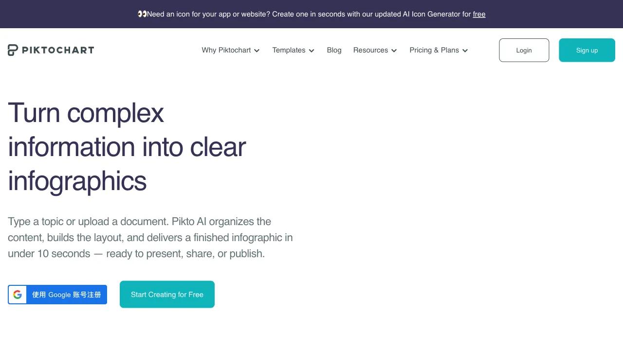
Piktochart (piktochart.com) is an online visual content creation tool with four core use cases: Infographics (its signature strength), Visual Reports, Presentations, and Posters & Social Media Graphics. In recent years, it has also extended into AI video tools (with capabilities similar to Piktostory). The product form is "professional template library + drag-and-drop editor + AI generation": select a template or let AI draft the initial version, replace the content, make fine adjustments, and export—all with zero design skills required.
It has built a deep user base in Western content marketing, education, and NGO circles. For a long time, "use Piktochart for infographics" was one of the default answers in these industries.
Core Features
Infographic Creation: The Foundation
Hundreds of scenario-based templates cover classic infographic types:
- Data-driven: Survey results, statistical comparisons, trend displays—translating dry numbers into visual impact
- Process-oriented: How-to steps, business process diagrams
- Timelines: Development history, project milestones
- Comparative: Solution PKs, product comparisons
The value of templates lies in their built-in professional judgment on information design (information hierarchy, visual flow, color logic)—users only need to swap in content, while the template ensures a baseline level of design quality. This is the product logic behind "democratizing the professional passing grade."
AI Generation
The entry point for the new era: input a text description or paste a piece of content, and the AI parses the information structure to directly generate the framework and layout for an infographic or presentation—the cold start from blank to 80% draft is automated. The combination of AI drafting + template refinement compresses production speed by another notch.
Data Charts
Built-in chart components such as bar charts, line charts, pie charts, and maps allow you to paste data (or import a spreadsheet) to generate visuals instantly, with styles unified across the theme—no need to take screenshots from Excel for the data sections of reports and infographics.
Reports & Presentations
Multi-page visual templates for annual reports, industry reports, and impact reports (high-frequency scenarios for NGOs and educational institutions), as well as the creation and export (PDF/PPT) of visually driven presentations, extending the "design language of infographics" to long-form documents.
Branding & Collaboration
Team brand asset management (unified color palettes, fonts, and logos) and multi-user collaborative editing—standard capabilities for institutional users to maintain visual consistency in their outputs.
Comparison with Similar Tools
vs Canva: The giant you can’t avoid—Canva’s template volume, functional breadth, and ecosystem comprehensively crush the competition, with infographics being just one of its categories. Piktochart’s survival logic is vertical depth: its templates for infographics and visual reports are more professional, and its data components are more targeted. Those with heavy infographic needs should use Piktochart; those with general design needs should go straight to Canva. This is an honestdiversion (diversion).
vs Infogram: Another expert in data visualization, strong in interactive charts (dynamic data embeddable in web pages); Piktochart excels in the design completion of static infographics. For live charts embedded in webpages, choose Infogram; for finished images to post on social media, choose Piktochart.
vs Venngage: A direct competitor with an almost mirrored positioning. The differences in template style and pricing are greater than those in functionality—both free versions allow you to make one graphic. Whose aesthetic appeals to you is the deciding factor.
vs Napkin AI: A new-generation tool for "automatically turning text into images," with more aggressive automation; Piktochart retains more manual control and template depth. Choose Napkin for speed, choose Piktochart for precision.
vs Drawing in PowerPoint: PPT is versatile, but creating infographics requires craftsmanship. The gap between what an amateur produces manually is visibly apparent. This is the very reason template tools exist—to bridge this craftsmanship chasm.
Who Should Use Piktochart?
Content Marketing & New Media Teams: Visualizing data insights and industry reports is a powerful tool for gaining followers. The regular need to produce infographics aligns perfectly with its template library—its core customer base.
Educators: Diagramming knowledge points, creating teaching posters—a low-barrier production line for visual teaching materials. Students can also use it for course assignments.
NGOs & Non-profits: Visualizing annual reports and impact reports is a rigid demand in this industry. Piktochart’s template accumulation in this scenario is industry-grade.
HR & Internal Corporate Communications: Diagramming policies, onboarding guides, internal data reports—the communication effect of "turning notices into images" is something you try once and never go back from.
Non-designers in Data Roles: Analysts’ insights need to be seen; infographics serve as the translation layer between data and the audience.
Limitations
Interactive and real-time data visualization is not its domain—for dynamic dashboards, look to Tableau/Flourish. Piktochart produces static finished products.
The free version has obvious limitations (template range, watermarks, export restrictions); serious usage basically requires a paid plan. Chinese font support and layout adaptation are not as smooth as for native English content; try one graphic with Chinese content first to verify the visual effect before committing.
AI generation is still at the "drafting assistant" level; complex information structures still require manual organization—the clearer the logic of the content you feed it, the more usable the output will be.
Pricing
The free version allows you to experience basic templates and editing (with watermarks and quantity limits); paid subscriptions unlock the full template library, brand features, and team collaboration in tiers. Prices are mid-range among similar tools. Refer to the official website for specifics.
The way to judge Piktochart is simple: look at the content you’ve recently published. Are there any articles where "the data was clearly substantial, but the readership was mediocre"? Pick one, throw its core numbers into Piktochart to create an infographic, and post it again—the comparison in distribution data will make the decision for you on whether to keep this tool.