

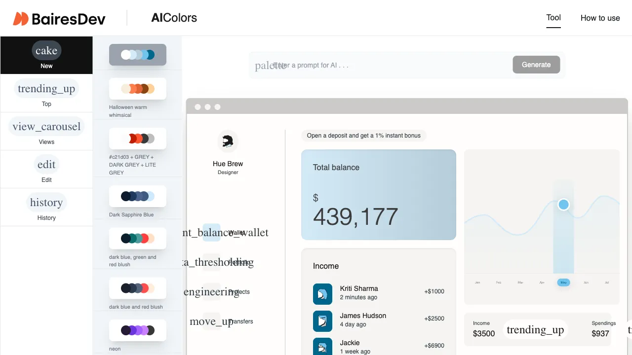
Color pairing is the most elusive aspect of design. Without systematic training, people often struggle to choose a suitable color combination when facing a blank canvas. Picking colors at random usually results in discordant schemes, while referencing competitors raises concerns about similarity. AIcolors is an AI tool specifically designed to solve this problem. By inputting your brand style, usage scenarios, or emotional descriptors, it generates a complete palette for you and showcases real design cases demonstrating how these color combinations perform in actual contexts.
Entry point changed (checked 2026-09-06): aicolors.co now issues a permanent 301 redirect to bairesdev.com/tools/ai-colors. The tool lives under BairesDev's tools section rather than as a standalone site.
What is AIcolors?
AIcolors (aicolors.co) is an AI-driven color tool whose core function is to generate palettes based on text descriptions while providing reference from practical design case studies. It is not merely a random color generator; instead, it understands your contextual requirements and generates color schemes with clear design logic.
The usage method is simple: describe your needs in the input box—whether that's brand positioning ("a sustainable outdoor brand"), emotional tone ("fresh, summery, energetic"), usage scenarios ("dark-themed SaaS product interface"), or by referencing a specific style ("minimalist Nordic aesthetic")—the AI generates a complete palette including primary colors, secondary colors, and neutral tones.
Core Features
Text to Palette
This is the core feature of AIcolors. Your descriptions do not need professional color terminology; everyday language works perfectly. For example:
- "A medical technology company, professional and trustworthy, primarily targeting enterprise clients"—generates a business-oriented palette dominated by deep blue and silver gray
- "A children's education app, lively and fun, suitable for elementary school students"—produces a bright, multi-color scheme
- "A premium coffee brand with caramel notes, wood textures, warmth"—creates an artisanal coffee palette featuring warm browns, cream, and dark chocolate
Each generation includes 4–6 colors centered around the primary color, complemented by secondary and accent tones to form a layered, complete system rather than just random isolated hues.
Color Palette Examples for Reference
This is where AIcolors adds value beyond simple color generation tools. Judging a palette's practicality by looking at isolated swatches alone can be misleading—how colors perform on large background areas differs significantly from their effect as small accents. AIcolors provides an extensive library of real-world examples, allowing you to see how specific palettes look when applied in UI interfaces, posters, and brand materials. This helps you determine whether a palette is suitable for your specific use case.
This dual functionality—combining "color generation" with "palette reference"—makes AIcolors particularly useful for users lacking design experience; seeing practical examples often proves more immediately helpful than theoretical explanations alone.
Multiple Color Format Outputs
Generated palettes provide color values in multiple formats: HEX, RGB, and HSL—covering the needs of both design software (Figma, Sketch, Adobe Suite) and code development (CSS). Simply copy a color value and paste it directly into your design tool or code editor to use immediately.
Saving and Managing Palettes
You can save favorite palettes for easy reference and reuse later. If you are building a visual system for a project, saving multiple candidate palettes side-by-side allows for convenient comparison and selection—far more efficient than searching anew each time.
The Importance of Color in Design
We'll briefly discuss the role color plays in design; understanding this will help you leverage AIcolors more effectively.
Color is not merely an aesthetic concern—it directly influences how users perceive a brand, their trust in a product, and where they allocate attention to information. Research indicates that 60–90% of the impression people form about a product within the first 90 seconds comes from color alone.
Specifically:
- Healthcare and Finance: Blue and white convey reliability and professionalism.
- Sustainability and Wellness: Green tones evoke associations with nature and health.
- Luxury Goods: Black, gold, and deep purple communicate a premium feel.
- Children's Products and Entertainment: High-saturation multi-colors express energy and playfulness.
- Technology and SaaS: Blue, white, and gray paired with clean typography convey modernity.
There are established rules governing how colors relate to one another: complementary colors (those opposite each other on the color wheel) create strong contrast; analogous colors (adjacent on the wheel) foster harmony and unity; triadic colors (equally spaced around the wheel) generate richness and vibrancy. The palettes generated by AIcolors already account for these principles—they are not randomly selected.
Comparison with Other Color Tools
vs Coolors.co: Coolors is one of the most popular online color tools, allowing for random generation and manual adjustment. While flexible in function, it requires you to judge whether a palette works well on your own, demanding some design knowledge. AIcolors' text-based description approach is more user-friendly for those unfamiliar with color theory; simply describe what you need, and receive palettes aligned with that direction.
vs Adobe Color: Adobe Color is a professional-grade tool featuring wheels, harmony rules, gradients, and other features suited to designers who understand color principles. AIcolors offers a simpler workflow tailored for non-professional users.
vs Khroma: Khroma is an AI-driven palette generator that learns your preferences by having you select colors it likes before generating palettes matching your taste. In contrast, AIcolors focuses on generating specific solutions based on text descriptions; the two tools operate with fundamentally different approaches.
vs Huemint: Huemint specializes in brand color systems and allows direct previewing of palettes applied to logos or web scenarios. AIcolors distinguishes itself through a richer library of palette examples for reference.
Who Should Use AIcolors
Marketing Professionals: When creating event materials, promotional posters, etc., you often need to quickly establish a color direction. Describing the theme and generating colors with AIcolors is far more efficient than manually testing shades one by one.
Content Creators & Social Media Operators: Cover images and supporting assets require a unified visual style. Use AIcolors to define a fixed palette so that all content maintains consistent coloring, building strong brand recognition.
Startup Founders / Small Business Owners: Without dedicated designers on staff, you must handle your own brand visuals yourself. AIcolors helps establish a color system at the early stages of branding—a far more professional approach than picking colors arbitrarily.
Frontend Developers: Whether working on personal projects or SaaS products requiring an attractive interface, describe your product positioning to generate UI-ready color schemes with AIcolors.
Figma/Sketch Users: When seeking direction for a design project's palette, use AIcolors as an inspiration tool: generate candidate options and import them into your design software for refinement.
Usage Tips
Be Specific in Your Descriptions: "Tech company" is too vague; try instead something like "SaaS data analytics platform targeting B2B enterprise clients with a strong professional feel—avoid overly playful colors." The more precise the description, the better aligned the results will be to your needs.
Generate Multiple Options Before Choosing: Since AIcolors produces different outputs each time, generate several sets of palettes, save those you like, and select the best fit from among them.
Evaluate Palettes in Context, Not Just as Swatches: Don't judge solely by looking at isolated color blocks; click into examples to see how these palettes perform when actually applied within a design context for an intuitive assessment of suitability.
Organize Colors Into Your Figma Style Guide: Once you've settled on a palette, create a color system in Figma (primary/secondary/neutral/accent) and reference it consistently across your project—avoid re-selecting colors repeatedly from scratch.
For those without formal design systems training, AIcolors is an incredibly practical tool that solves the common dilemma of "not knowing what colors to use." It's completely free. While color selection isn't necessarily the hardest part of design, it remains one of the most visible factors influencing overall visual impact. Having a dedicated tool assist with this decision-making process yields tangible improvements in final outcomes.