

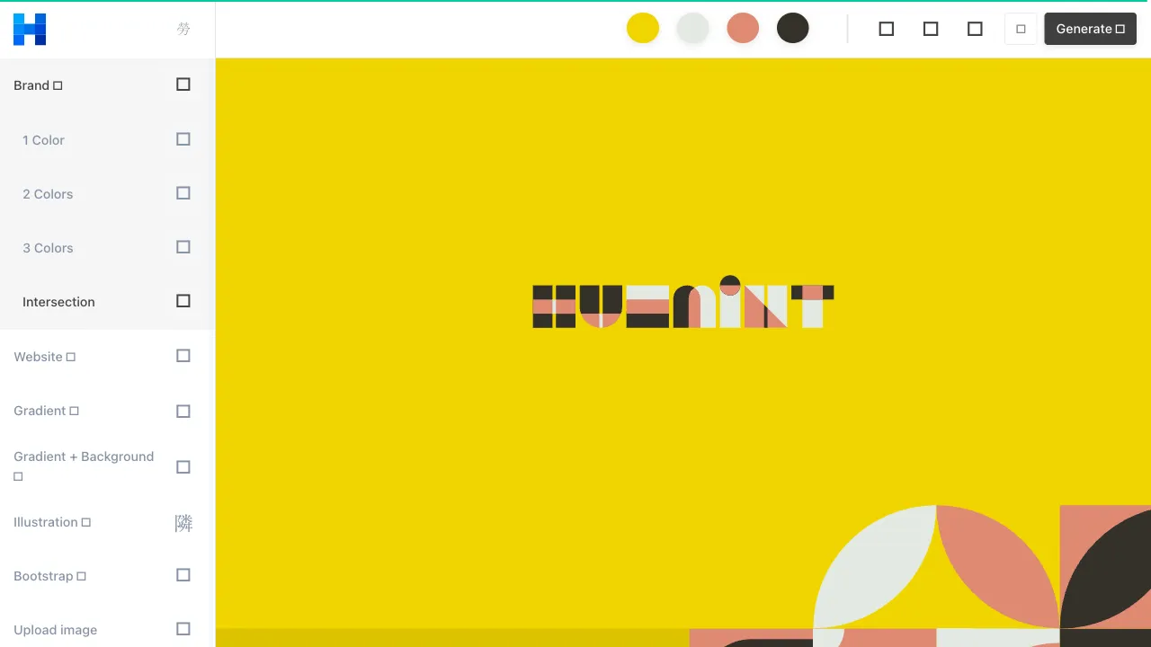
Color theory can seem esoteric, and applying it is even more so. Many people pick colors based on intuition—using what looks good and swapping what doesn’t—but struggle to articulate why a palette works or fails. Huemint solves this with an intuitive approach: it doesn’t just give you colors; it lets you see them applied in real-world design scenarios, enabling decisions at the level of design perception rather than guessing outcomes from isolated color swatches.
What is Huemint?
Huemint is an AI-driven brand color tool distinguished by its real-time preview system: as you adjust colors, it instantly displays the results within simulated design contexts—logos, web interfaces, business cards, and posters. You aren’t looking at isolated color blocks; you are seeing how those colors perform in actual design applications.
This "what you see is what you get" experience is Huemint’s core differentiator among color tools.
The tool is completely free, requires no account registration, and is ready to use immediately upon visiting the website.
Core Features
Design Scenario Previews
Huemint offers several design scenarios as preview templates:
- Brand Logo: See how your palette looks in a logo, including both dark and light background variations.
- Web Interface: Simulate color application across web elements such as navigation bars, buttons, cards, and text.
- Business Card: Observe color performance in brand collateral contexts.
- Poster: Preview color schemes in graphic design layouts.
By switching between scenarios with the same palette, you can intuitively gauge whether a set of colors works well across multiple contexts or is limited to a specific one. This feature is particularly valuable for users building consistent brand visuals, allowing them to visualize applications before finalizing a palette.
AI Color Generation
Input one or anchor colors (e.g., if your primary brand color is already set and you need complementary secondary colors) or use random generation. Huemint’s AI generates harmonious color combinations that align with your inputs.
Its algorithm considers harmonic relationships between colors, ensuring the generated schemes are logically sound within color theory rather than random. Consequently, the results are typically usable without significant adjustment.
Interactive Adjustment
Generated palettes can be refined interactively. Lock colors you like and let the AI regenerate the remaining hues, or manually adjust the hue, saturation, and brightness of specific colors to see real-time changes in the overall palette.
This "AI generation + manual fine-tuning" workflow is more efficient than pure manual adjustment and offers greater control than relying solely on AI.
Harmony Indicators
Huemint provides a visual harmony indicator for each color combination, helping you assess whether the relationship between colors is balanced. If contrast is too strong, it may appear harsh; if too weak, it may lack depth. The harmony indicator offers an objective reference point.
Why "Real-Time Preview in Design Scenarios" Matters
Many color tools provide only combinations of color swatches. Viewing a swatch and seeing how that color performs in actual design are two entirely different experiences.
For example: two colors might look harmonious in isolated blocks, but if one is used for text and the other for the background, insufficient contrast could render the text illegible, making the palette impractical. Similarly, a palette that looks great on a white background may perform poorly on a dark background.
Huemint allows you to "try on" a palette in simulated design scenarios before finalizing it, reducing the risk of discovering poor results only after applying colors to a design. For users with limited design experience, this is genuinely helpful—you don’t need extensive color application expertise to judge quality; seeing is believing.
Comparison with Other Color Tools
vs Coolors.co: Coolors is the most popular online color tool, offering convenient random generation and manual adjustment with a large user base. However, it displays only color swatches without design scenario previews. Huemint’s scenario preview is its key advantage.
vs AIcolors: AIcolors excels at generating palettes from text descriptions, ideal for starting from scratch when you have no initial color ideas. Huemint shines in design scenario previews, making it better suited for validating how colors perform in actual designs. The tools can complement each other: use AIcolors for initial direction and Huemint to verify results.
vs Adobe Color: Adobe Color is a professional-grade tool featuring color wheels, harmony theories, and integration with Adobe software, catering to professional designers. Huemint is better suited for non-professional users.
vs Khroma: Khroma generates palettes by learning your preferences, requiring an initial training period. Huemint requires no training and is ready to use immediately.
vs Paletton: Paletton is a theory-based tool allowing precise adjustment of color relationships on the color wheel, ideal for users who understand color theory. Huemint is more intuitive and does not require knowledge of color theory.
Who Should Use Huemint?
Startups and Early-Stage Brands: When establishing a visual identity, Huemint helps you preview and validate colors across multiple design scenarios rather than making decisions based solely on swatches.
Product Designers: For UI design, Huemint’s web interface preview helps assess how colors perform across buttons, navigation, backgrounds, and other elements.
Content Creators: To maintain a unified visual style, Huemint helps select palettes that look good across various outputs like posters and cover images.
Front-End Developers: For personal projects requiring color schemes, Huemint’s output includes HEX codes ready for direct use in CSS.
Mid-Level Graphic Designers: If you have design knowledge but need to quickly generate candidate palettes to select and refine, Huemint’s AI generation and interactive adjustment workflow is ideal.
Practical Workflow
- Select a Preview Scenario: Choose your primary design context (Logo? Web? Poster?) for the most relevant preview results.
- Generate Initial Palette: Use random generation or input an existing primary color as an anchor to generate a palette.
- Evaluate in Context: Switch to the design scenario preview to see how the colors perform in actual application.
- Lock and Iterate: Lock satisfactory colors and let the AI regenerate others until the entire palette meets your needs.
- Export Color Values: Record the HEX values of your selected colors for import into design tools or code.
The entire process typically takes 10–20 minutes to finalize a usable palette, significantly faster than manually testing colors via a color wheel.
Usage Tips
Define the Primary Color First: If you have an established primary brand color (e.g., your logo color), lock it and let the AI generate harmonious secondary colors. This keeps the primary color constant while the AI handles the rest.
Verify Versatility Across Scenarios: Check different preview scenarios (Logo, Web, Business Card) to ensure the palette works well across multiple contexts, not just one.
Generate Multiple Options: Don’t settle on the first acceptable result. Generate several options, save candidates, and compare them to choose the best fit.
Save Final Colors to Figma or CSS Variables: Organize finalized colors into a system (primary/secondary/neutral/accent) and reference them consistently in your project to ensure visual coherence.
Huemint effectively combines design aesthetics with practicality. It is free, requires no registration, and has a very low learning curve, making it a valuable tool for anyone needing to make color decisions before starting a design.