

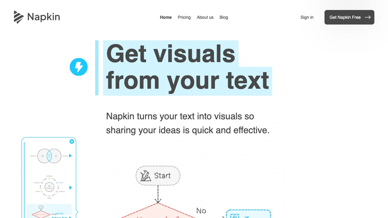
You’ve written a block of text and want to turn it into a chart, flowchart, or infographic, but you don’t know how to design, aren’t familiar with Illustrator, and don’t want to spend time piecing things together in Canva—Napkin AI is built for this scenario. Its core capability is simple: you input text content, it automatically extracts key information, and generates corresponding visual graphics. The entire process is nearly fully automated.
What Is Napkin AI?
Napkin AI (napkin.ai) is an AI-driven visual content generation tool focused on transforming text into graphical expressions. Its design philosophy stems from the concept of a "napkin sketch"—great ideas are often clear enough to be drawn on a napkin, and Napkin AI aims to automate this process using AI.
The core workflow is straightforward: paste or input your text content, Napkin AI analyzes its semantics and structure, automatically generates multiple visualization options, you select the one that satisfies you, make minor adjustments as needed, and export for use.
Core Features
Text-to-Graphic Conversion
This is Napkin AI’s primary function. Input a descriptive paragraph—whether it’s a process explanation, concept definition, data comparison, or organizational structure—and after the AI understands the content, it generates a corresponding graphical representation:
- Flowcharts: Step-by-step descriptions → Flow arrows and diagrams
- Comparison Charts: Multi-option comparative text → Side-by-side tables or cards
- Hierarchy Diagrams: Hierarchical relationship descriptions → Tree diagrams or pyramid charts
- Timelines: Chronological events → Timeline graphics
- Cycle Diagrams: Cyclic process descriptions → Circular flowcharts
- Concept Maps: Core concepts and relationships → Node-and-edge relationship diagrams
Napkin AI automatically identifies the most suitable graphic type for each text structure, typically generating multiple versions for you to choose from.
Style and Color Customization
The generated graphics can be customized in style—adjusting line thickness, color themes, icon styles, and more. Napkin AI offers several preset visual styles, ranging from clean and professional to lively and creative, allowing you to match different usage scenarios.
Integrated Icon Library
Elements within the graphics can have their icons searched and replaced via an built-in icon library covering various themes. This ensures that the generated visuals are not just boxes and arrows, but complete infographics supported by semantic icons.
Export Formats
Once satisfied with the result, you can export the graphics in formats such as PNG or SVG. SVG is a vector format that can be scaled infinitely without loss of quality, making it suitable for PPTs, posters, reports, and more.
Document Embedding
For users writing on platforms like Notion or blogs, Napkin AI-generated graphics can be directly embedded into documents to enhance readability.
Typical Use Cases
PPTs and Presentation Materials: Transforming text-heavy slides into graphics instantly boosts visual appeal, without requiring advanced PowerPoint skills.
Blog Posts and Technical Articles: Generating infographics for sections involving processes, architectures, or comparisons helps readers understand complex content far better than plain text alone.
Product Documentation and Manuals: Expressing functional workflows and operational steps visually makes them more intuitive and reduces the cognitive load on readers.
Training Materials: Visualizing key training points makes learning materials more engaging and improves knowledge retention.
Social Media Content: Converting core viewpoints into infographics for knowledge-based content makes it more shareable and suitable for social platforms.
Comparison with Other Tools
vs Canva: Canva is a comprehensive design platform with rich templates and a massive user base, but it requires manual template selection and drag-and-drop layout, incurring time costs. Napkin AI’s advantage lies in automating the text-to-graphic process, reducing manual layout work, though it lacks the fine-grained design flexibility of Canva.
vs Miro / Whimsical: These whiteboard tools lean toward collaboration and ideation, requiring manual construction of graphics. Napkin AI focuses on automatic visualization of content outcomes. While their use cases overlap, their emphases differ.
vs PowerPoint / Keynote SmartArt: Office suite’s SmartArt can also convert text to graphics, but its styles are relatively fixed and dated. Napkin AI offers more modern designs and smarter, AI-driven content analysis.
vs Beautiful.ai: Beautiful.ai is an AI-assisted PPT tool that automatically beautifies slides. Its positioning is full deck creation, whereas Napkin AI focuses specifically on generating individual graphics, making it more specialized.
vs Infogram / Piktochart: These are professional infographic tools with rich features and data visualization support, but they require more manual operation. Napkin AI is more automated, though it falls short in dedicated data charting (bar charts, line graphs, etc.) compared to these specialized tools.
Who Is Napkin AI For?
Professionals Who Frequently Write Reports and Presentations: Quickly converting text into graphics enhances the expressiveness of presentation materials and shortens production time.
Content Creators and Bloggers: Generating accompanying visuals for articles improves content quality and dissemination effectiveness.
Product Managers and Operations Staff: Napkin AI helps quickly create clear visualizations for feature explanations, process mapping, and competitor comparisons.
Educators: Adding AI-generated graphics to courseware and learning materials improves the readability of teaching content.
Non-Designers Who Need to Use Graphics: With zero design background but a need for professional-looking visuals, Napkin AI lowers this barrier significantly.
Limitations
For scenarios requiring precise data visualization (line charts, bar charts, scatter plots), Napkin AI is not the right tool; professional data charts should still be created using Tableau, Excel, or Flourish.
The style of generated graphics may sometimes deviate from your expectations. The AI’s "understanding" isn’t always perfect, so you may need to try multiple times or make manual adjustments.
Support for Chinese content is continuously improving, but understanding complex Chinese semantics may not yet be as accurate as it is for English.
Pricing
Napkin AI offers a free tier with basic graphic generation capabilities, while its paid plans unlock additional export limits, more style options, and collaboration features. For the most accurate details, please refer to the official website.
For scenarios requiring rapid conversion of text into visuals, Napkin AI fills a genuine need—eliminating the requirement for design skills and significantly speeding up the process compared to manual creation. If you often struggle with wanting to add images but lacking the time for design work, Napkin AI is worth trying in its free version.